Client:
Pratt Institute Class: Information Visualization
Project Duration:
1 month
Role(s):
Data Analyst
Team:
Independent Project
Tools Used:
- Tableau Public
- Openrefine
- Datasets from Moneypuck.com
- Rink Overlay from War on Ice Blog
Skills:
- Tableau Desktop
- Data Analysis
- Data Cleaning
Learning Outcome:
Research: Develop complex questions and apply appropriate methods to answer them
Let’s face it: 2022 is the only year that Devils fans are hopeful the team will make it to the Stanley Cup Playoffs. Over the course of 2016-2020, the Devils ranked lowest in the Eastern Division of the NHL three out of the four years and were in the bottom six teams of the entire league for three of the four years, both with an exception for their 2017-2018 season. Since 2016, the team has had four different head coaches, and only two players from the 2016-2017 season still remain on the team in the 2022-2023 season. While NJ Devils fans celebrate the Devil’s recent record-breaking win streak of thirteen games in the 2022-2023 season – the longest in Devils history – it’s important to look at the team’s previous seasons to understand where they could have been lacking.
My interactive data visualization focuses on exploring the NJ Devils’ home game shots from 2016 to 2020. The goals for the final visualizations were to see whether there were any strategy changes over the four years, what type of shot was most popular depending on where the shot was made on the ice, and to see how they compared in shooting relative to their competitors. As a Devils fan and former hockey player, I was extremely interested to see what insights I could find through these visualizations.

Methodology
Tools Used
Tableau Public: A free version of Tableau that makes both static and interactive visualizations featuring a user friendly interface
Openrefine: An open source data cleaning software that can handle large amounts of data
Moneypuck.com: A free hockey database that has datasets of every team and game since the 2007-2008 season
The project began by first gathering data from Moneypuck that had to do with the Devils’ home games shot data during the 2016-2020 seasons. The shot data from Moneypuck consisted of all shots taken from every NHL team and every game for a particular season, so it was very important to clean each dataset to feature only the home games for the Devils. Each of the four datasets went from 100,000 rows to 3,000 – 4,000 each. The final dataset for the following visualizations had 13,160 individual inputs, featuring shots taken by the Devils and their competitors for each home game.
While I initially was opting for a static shot map visualization, the best course of action to fully engage with the data given was to create an interactive shot map in which the user could explore the shot maps of different seasons, different players, as well as be able to filter between goals, missed shots, and general shots on goal.
The Interactive Shot Map
Due to my content management system’s (in)capabilities, I am unable to embed the interactive shot map directly onto this page. Feel free to check out and explore my interactive visualization here and my supplementary visualizations here.
Let’s take a look at the 2019-2020 season shot map:
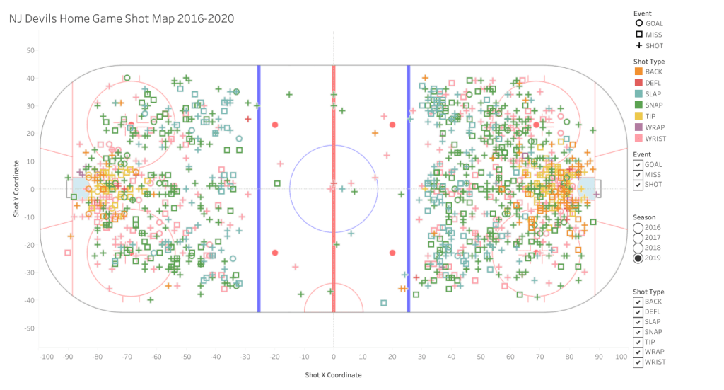
This visualization gives great insight into which shots were most popular depending on where the players were on the ice. Tip, wrap, and back shots seem to be very condensed by the goal, while slap shots are most prominently used between the top of the circles and the blue line. Tip, wrap, and back shots are quick and deceptive shot styles, making them a good option when the player is close to the net, but can easily be blocked by a goalie and require good coordination to be successful.
From where the slap shots are located on the map, this is probably a very popular shot style for defensemen, since they need to stay at the top of the zone in case their opponent manages to take control of the puck and get it out of the zone. Slap shots require a lot of power, and are typically used to either try to score or keep the puck in the zone, which is a defensemen’s main priority in the offensive zone. Snap and wrist shots seem to have more general usage, since they are dispersed pretty evenly throughout the offensive zones.The least used shot style is the deflection shot. This could be due partly to its complicated nature and intense precision needed to make the shot.
Looking at the shot map as a whole, there is a light trend with the shots making a subtle “C” shape starting from the goalie’s net and moving outwards towards the corners of the zone. This is most likely due to the different plays the Devils were using, and could be that the areas along that “C” have the most opportunities for scoring due to the angle at which the player is in relation to the net. Now that we’ve seen the prominent locations of different shot types on the ice, let’s take a look at the most successful shot types in terms of scoring a goal.

A Deeper Dive
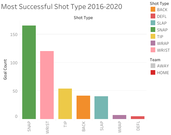
This graphic follows the same color scheme featured on the interactive map to make it easier for the user to understand and clearly differentiate each shot type. Based on the chart that shows how many goals were made with each shot type, it is clear that snap and wrist shots are the most successful shot types for the Devils. This is most likely due to the high number of times these shot types were used in comparison to the others, but also gives insight into the Devils’ strategy or lack thereof. The lesser used shots happen to be less successful, but also are the shots that require more skill, coordination, and teamwork. In their past seasons, the Devils were playing more for survival rather than to win the game. When in a stressed environment, they resorted to using more general shot styles rather than playing with strategy, which also allowed for more independent play from the players rather than working together as a collective. Diving deeper into goals scored, let’s take a look at the most popular period for Devils to score a goal and how their opponents may have played into that.

In the first period, it is pretty evenly distributed between the opponents and the Devils for who scores the most goals. 2017 was the Devil’s most successful season out of the four, which can explain the higher gap between goals scored. In 2016 and 2019, there is a large jump between the first and second period for the Devils. This is most likely them realizing they need to kick it into high gear after most likely being behind in the first period. In the third period, almost every year the away teams score more goals than the Devils; this could be due to them getting tired by the end of the game, as simple as it sounds. Overall, the Devils tend to score the most goals in the second period, which could be the result of them realizing they need to play better in order to beat their opponents, but they quickly lose steam by the third period.
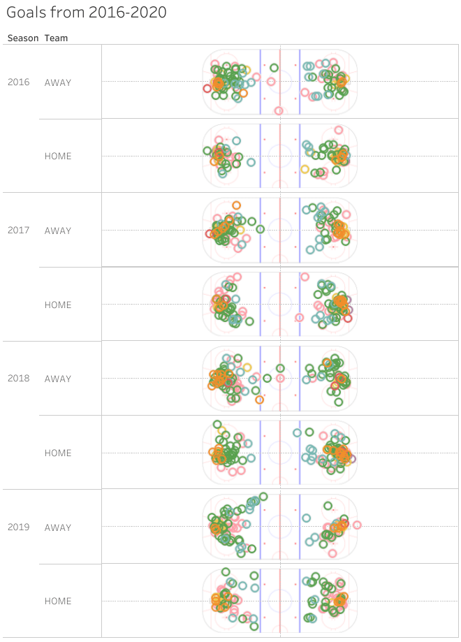
This last visualization features goals from the Devils and their opponents. Let’s break this down a little bit. When the shot map more clearly represents a “C” shape, it shows that the team was using all players on ice to their advantage and working as a team in order to score a goal. In 2016 and 2018, the Devils were the worst in the Metropolitan division, and the shot maps show a very little resemblance to the “C” shape. What’s worse is that their opponent’s maps were similar, meaning they most likely dumbed down their playing to match the Devils. The goals scored by away teams are also dispersed farther from the net, showing the ease of scoring against them in these two years. In 2017 and 2019, the better seasons of the four, there is a closer resemblance to a “C” but still show the away team’s ability to score farther from the net.
Overall, the graphics show two main weaknesses that Devils faced through 2016-2020. First, the shot maps show they were not focusing on strategy in order to play the game, but rather just shooting on the net whenever they had the chance to. Their second weakness was the inability to use more complicated shot types, which could have made them more successful if they worked as a team. These two worked hand in hand to limit the success of the Devils, and we can only hope that they have learned from this (and that their new head coach, Lindy Ruff, is coaching them better!)

Reflection
Overall, I am very happy with my visualizations, especially the interactive map since I did not intend nor know how to to make an interactive visualization at the beginning of this project. I feel my design choices were made to clearly display the visualizations created, and all graphics made go together to paint a picture of the Devil’s performance. Additionally, I feel like the goals I set for myself at the beginning of this project were met. The process to make these visualizations was not the easiest, as I had either Tableau Public or Openrefine shut down on me multiple times, but alas I persisted! I am also very happy that I was able to learn a few more things about each software that I did not know prior to this project and brush up on my skills.
I am afraid, due to the size and detail in the dataset I used, that I may have missed some categories that would have provided some more insight into the Devils’ performance. In the future, I do think I will create a map featuring specific player maps since I decided against it for the purposes of this project, and also take the opportunity to explore more parts of the data set that I may not have paid attention to during this project.

Leave a comment