Client:
Pratt.edu Site Development Team
Project Duration:
3 months
Role(s):
Data Analyst, Editor, Meeting Leader
Team:
Evelyn Mukherjee, Leewon Seo, Ave Deng, Dominique Dorvil
Tools Used:
- Google Analytics 4
- Looker Studio
Skills:
- GA4
- Data Analysis
- Figma
- Looker Studio
Learning Outcome:
User-Centered Design: Identify relevant users and develop meaningful and engaging experiences for them
Pratt has recently relaunched their website in an effort to spruce up its style and keep up with new digital trends as a design school. Following the site’s relaunch, Pratt’s site development team wanted to see how effective their new site was at drawing in visitors and getting them to look at their academic program and application pages.
For this analysis, Pratt had a special interest in the following pages:
- Pratt News
- Pratt Events
- Daily Hub
- Prattfolio
They wanted to understand how these pages were impacting the site’s performance:
- Were they driving traffic to Pratt’s academic program and application pages?
- Were they increasing the overall site traffic and engagement?
- How were users interacting with these four pages?
My team used Google Analytics 4 to conduct our research to determine how the four pages on Pratt’s website were performing. Within our analysis, it was my responsibility to find insights for Pratt’s events page.

Methodology
Tools Used
Google Analytics 4: A widely used analysis resource that tracks various metrics on a website, including page views, number of users, average session time, and much more.
Looker Studio: A platform created by Google that allows users to create different dashboards to suit different needs and automatically plugs in Google Analytics 4 data.
| Google Analytics 4 | Google Looker Studio |
| StrengthsReal-time dataDefinitions of metrics providedRelatively user-friendly and easy to pick up | StrengthsCan be used to make very pleasing dashboardsUser-friendly and intuitiveEasily shareable |
| LimitationsNo demographic tracking enabled for Pratt.eduNot all metrics are readily available; you have to create them through explorationsMany numbers are estimated rather than exact, making it hard to have completely accurate data | LimitationsNot all metrics on GA4 can be visualized through Looker StudioMetric definitions differ between Looker Studio and GA4 |
Initial Client Meeting
Our project began with an initial meeting with our clients. The goal of the meeting was to learn more about the context of the project, what they wanted to uncover through the analysis, and how we could help them in the long term once the project was done.
Analysis Stage
After our meeting with our clients, it was important to come up with a list of research questions that would guide our individual analysis. Based on our client’s comments and our knowledge of site analytics, we devised four research questions:
- How are users interacting with Pratt’s events, news, prattfolio, and daily hub pages?
- Demographic wise, who is visiting these pages the most?
- Are the selected pages driving traffic to Pratt Program information pages?
- Are the pages successful in gaining interest/applicant leads in Pratt programs?
Once we gained access to the Google Analytics 4 account for the Pratt.edu site, we began our analysis for each of the four pages. While we mainly focused on the four pages, we found some general insights regarding the overall Pratt website as well.

Findings and Recommendations
Our group gathered three to four findings and recommendations for each page, as well as two additional findings that touched upon the general Pratt website. From all of our findings, we noticed three general trends that guided our final overall recommendations:
- Limited CTA’s for User Navigation
- Limited internal links to offer a more explorative experience
- Limited text on pages to optimize content for search engines
Let’s take a look at the insights gathered for the events page:
| 57.2% of Traffic to Events Comes from Organic Search |
Using Google Analytics 4’s exploration feature, I created an exploration that showed the number of entrances specifically to event-related pages, and set the main dimension to be the session default channel. To assure that I was only getting traffic that landed directly on the specific events pages from the channels, I measured them against user sessions.
Through the exploration, I found that 57.2% of traffic to the events pages were coming from organic search. This could mean that the events pages have good content optimization to make them rank relatively high in search engine results.
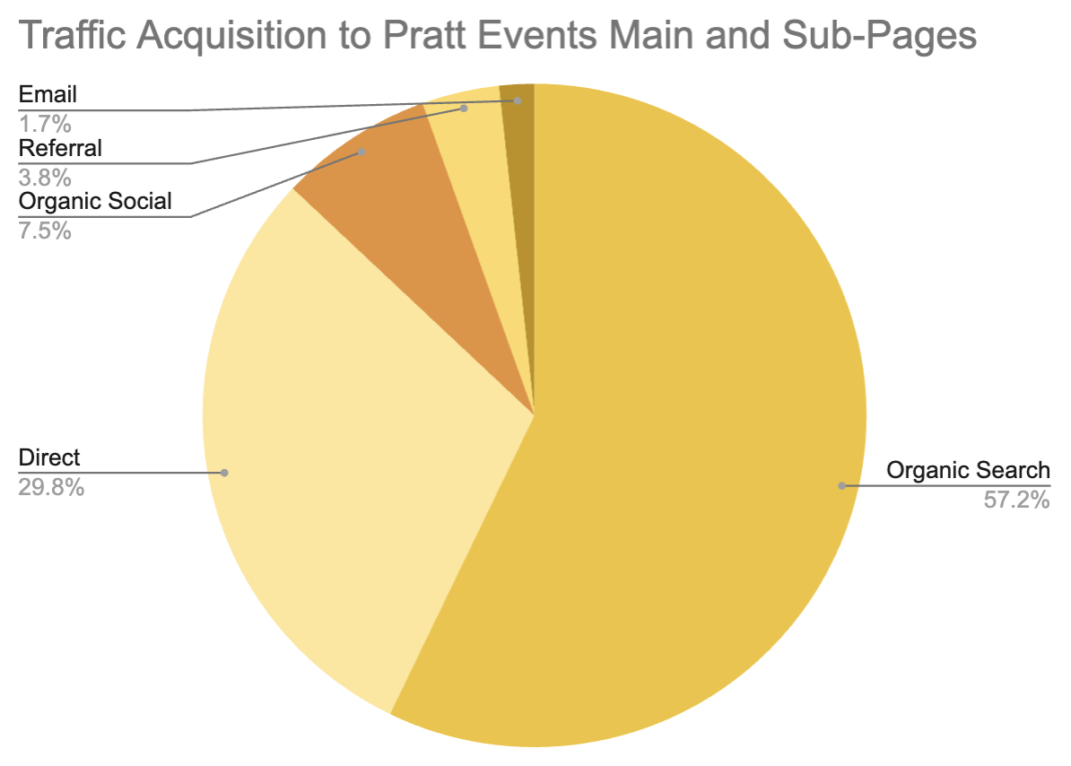
Figure 1: Traffic Acquisition Pie Chart. Data from Pratt.edu GA4
| Add More Content to Events Pages to Optimize Further |
Since organic search is performing well to get users to go to the events pages, it is important to continue optimizing the content in order to rank relatively high in search rankings. To optimize content, consider adding the following elements:
- Additional keywords in the HTML headings and meta-descriptions
- Internal links to other relevant places on the site
- Relevant images to push context of event
- Longer details and blurbs regarding the events

Figure 2: Current Event Listing on Pratt Events Page
If implemented, each of these components could work to bring more traffic from organic search to the events page and its many subpages. Adding additional keywords to the meta-descriptions or HTML headings will allow for more visibility in any search algorithm, internal links can increase the site’s credibility, relevant images can increase chances of the page coming up during image searches, and longer blurbs allow for more keywords to be included in the page’s content.
| Users Typically Navigate Back to the Homepage after Viewing Events |
After performing a path exploration to see where users typically go before and after they enter the events page, it was shown that users normally go to either the homepage, or the search page.


Figure 3 and 4: Backward (Left) and Forward (Right) Path Exploration to and from the Events page
One of our main goals is to get users to navigate to the program and application pages, so it is important we understand their user journey and how we can improve it to make the pages more navigable and seamless in progressing their browsing. Looking at the Pratt Events page, it seems that the navigation buttons go away once users start to scroll to view events further down the page.
| Make Navigation Buttons Permanent on Events Page |
To combat users hitting the back arrow to go back to the homepage or going to the search bar, it would be wise to make the top three navigation buttons that say, “Apply”, “Menu”, and “Search” be accessible even after the scroll further down the page. As you can see below, the buttons are visible when the user is at the top of the Events page.


Figure 5 and 6: Header of Events Page before (top) and after (bottom) users scrolls
By making the buttons permanent for the user even after they scroll, it could encourage users to explore the different buttons, especially after viewing the different events Pratt has to offer. By increasing opportunities for users to get to the application page or go to the menu to explore other aspects of the Pratt website, it could in turn increase the amount of traffic that can be turned into application page or academic program page traffic.
| Top Viewed Events Pages Have the Highest Bounce Rate |
Pratt’s most viewed events all have to do with happenings around the Pratt community, including open houses, student art galleries, or alumni events. It is very refreshing to see, as this means that users are really interested in seeing the ways they can get involved in the Pratt community, and shows the strong community Pratt does have that users want to view and celebrate work of other Pratt students.
That said, according to GA4, the top events also had the highest bounce rates.
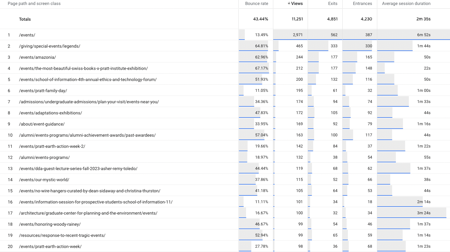
Figure 7: Google Exploration Showing Events Pages, Bounce Rate, Views, Exits, and Entrances
The bounce rate, in the context of GA4, means that users did not engage with any of the page content, or trigger any events, such as link clicks, navigation button clicks, etc., and either left the page open for 30 minutes or exited out of the page promptly.
| Increase Ways to Engage with Event Detail Page |
It is important to keep users engaged and wanting to interact with the site especially if the goal is to motivate them to become part of the Pratt community. Currently on most Pratt event detail pages, there are very limited ways to interact with the page.
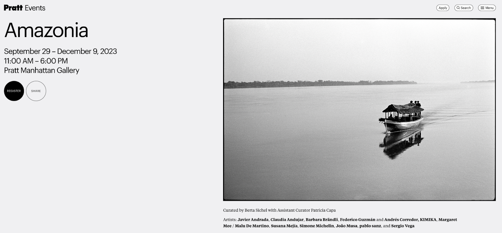
Figure 8: Event Detail Page for Amazonia Gallery
This can be remedied by including more links on the page which can in turn increase engagement and average session durations. Incorporating links such as:
- Similar events
- Related news articles
- Artist description or portfolio
- Pratt program that is hosting the event
Adding these components will make each detail page feel less like a dead end, and more like the beginning of their exploration of the Pratt website.
Additional Findings
In addition to the findings for the events page, I took it upon myself to look into some holistic data from the website.
Currently, the website’s bounce rate is 57%
After looking at the pages with the highest bounce rates, it was noted that most of them were either pages from the old site, or “Error 404” pages. Close to 500 of these obsolete pages had bounce rates of 100%, which are definitely impacting the overall bounce rate of the site. In order to remedy this, it is important to start clearing these pages from the site, as well as give users the option to navigate to related pages or back to the site’s homepage.
The Most Performed Event in 2023 was “Faculty List Click”
It is apparent that users are extremely interested in seeing who is working and teaching at Pratt, considering its great reputation as one of the best design schools in New York. There is an opportunity here to increase content on the site in relation to Pratt’s faculty, such as adding more faculty highlights, faculty news, faculty seminar events, as well as adding more “Apply” buttons to the faculty list page. Considering users are interested in our faculty, we should give them a clear option to check out the various program offerings in just one click to further convert them into prospective students from casual visitors.
While the findings in this case study touched only on the events page, you can view the findings and recommendations provided by my other group members by following the links below:
Pratt Website Analysis Presentation

Conclusion and Takeaways
Pratt’s new website design and aesthetic boost has left viewers with a lot to see and browse during their visits. While each page was given its own in-depth analysis, there are three key overarching themes noted during the analysis of the four Pratt pages:
OFFER MORE CTA’S
More CTA’s will offer a chance for users to be more interactive with the site, give them incentive to stay on the site, share the site’s content, or navigate the site better.
INCREASE INTERNAL LINKS
More links within pages will allow users to hop to different sections, as well as gain more context for the sections they are in. Especially within the four sections that were analyzed, having additional internal links to different parts of the site will increase the time spent on the site, and give users more information that could intrigue them further.
OPTIMIZE CONTENT AND REMOVE DEAD PAGES
Optimizing pages to include more content and keywords will help to improve general user experience, as well as improve where the page ranks in search results. Removal of dead pages will decrease user frustration, as they will not open pages that no longer work. With less users bouncing off the page after they realize it does not work, the general bounce rate of the site can improve.
Takeaways
Our clients were delighted with our findings, and are looking forward to engaging more with the findings in an effort to create new ways users can interact with the site more seamlessly.

Figure 9: Picture with our clients after our presentation
In the future, if we were to continue our development, I would be interested in taking a look at the Google Search Console, which explores what users are searching to get to the site. This could give us direct insights into how we can optimize the site content further and improve visibility.
Overall, I had a delightful experience partnering with the developers at Pratt to assist them in their quality assurance efforts with the new website. The site’s relaunch and new look really amplifies Pratt’s positioning as a top design school in New York, and it was a treat seeing how we can show new site visitors and potential donors just how great of a foundation Pratt Institute is.

Leave a comment