Client:
Words Without Borders
Project Duration:
4 months
Role(s):
Project Manager, Analyst, Test Moderator, Editor
Team:
Evelyn Mukherjee, Freya Pan, Sanjana Subramani, Trisha Khandelwal
Tools Used:
- Tobii Pro Lab
- GA4
- Hotjar
Skills:
- Evaluative UX Research
- Moderated User Testing
- Data Analysis
- Data Storytelling
Learning Outcome:
User-Centered Design
Abstract
Our design team embarked on a 4 month long project with Words Without Borders’ mobile site to provide recommendations that improve user experience and increase site engagement. With those goals in mind, we performed 8 eye-tracking studies and an in-depth site analysis using GA4 and Hotjar to bring to light some pain points regarding their homepage, article pages, search feature, and the multilingual function.
Introduction
With over 400,000 yearly site users, Words Without Borders offers fresh and exciting content that highlights authors from various countries around the world. Multiple genres, including fiction, non-fiction, poetry, graphic novels, and drama, are taken and translated into English for viewers to read, while still highlighting the piece’s cultural significance and original language.
In the past year, Words Without Borders relaunched their website to feature a new design that would hopefully increase user traffic, average session duration, and user engagement. Despite a new site look, they felt they were not meeting their goals set prior to the site’s relaunch. They reached out to my UX research team to help them break down where these engagement issues on the site might be stemming from. My team decided to look specifically at mobile, since over half of the site’s viewers for the past 7 months were mobile device users.
In our initial client meeting, there were four areas of the site the Words Without Borders wanted us to focus on:
- The Homepage
- The Search Feature
- The Article Page
- The Multilingual/ Multimedia Feature
Over the course of three months, my team performed a comprehensive end-to-end research study and ended with five recommendations that aimed to increase user experience, and in turn boost engagement on the Words Without Borders website.

Project Roadmap
After the initial client meeting, it was important to understand the current layout of the website and its metrics. As the lead group analyst, I used Google Analytics 4 and Hotjar to gather a few initial findings that would inform our research plan for our eye-tracking study:
- 53% of users since July 2023 accessing the site via their mobile devices (via GA4)
- The mobile engagement rate was 7% less than the overall engagement rate at 38% compared to 45% across all devices (via GA4)
- Less than 12% of users scrolled all the way to the bottom of the mobile homepage (via Hotjar)
With more users using mobile but getting far less engagement, it was critical we focused on what was barring users from further engagement on the mobile platform.
The Test
With the goal of increasing engagement and site exploration in mind, our team developed 4 user tasks and scenarios to address the four areas of concern: the homepage, the search feature, the multilingual function, and the article pages.
These user tasks and scenarios would be performed in an eye-tracking study with a retrospective think-aloud, to allow users to first focus on the tasks with limited distractions and influence. The retrospective think-aloud would be performed following the test in order to gain further insight into the user’s thought process while performing the tasks.
In order to gain both qualitative and quantitative data to support our findings and recommendations, we used the test recordings and RTA’s to gather qualitative data, and used three measurement tools to measure the tests quantitatively:
- Effectiveness: Overall Task Completion Rate
- Efficiency: Overall Task Completion Time
- Satisfaction: System Usability Scale Survey
These three factors would give a holistic overview of the site’s usability and ease of use.
The Participants
In order to properly gauge the site’s usability, our team was targeting two main audiences: those who have used Words Without Borders before and those who have not. We believe both perspectives would offer fresh insight that would be used in our analysis.
The participants for this study were recruited through both an email sent to the Pratt community, and an Instagram story posted by the Words Without Borders Team.
By the end of the recruitment process, we managed to recruit 2 participants who had used Words Without Borders before, and 6 new users, making a total of 8 participants for the mobile study.
Test Analysis Overview
With the 8 eye-tracking studies done, it was time to synthesize our results.
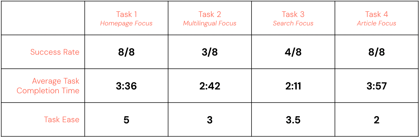
Effectiveness: The task success rate for all four tasks was 72%.
Efficiency: The average test completion time was 12:26 to compete all four tasks
Satisfaction: The SUS score, which was calculated from the answers to the ten question survey, came out to be 58.1, 10 points lower than the benchmark of 68.
With a below average System Usability Scale score, it was apparent that there was work to be done on the mobile site to improve usability and experience.
Task Breakdown:
What Worked?
There were three main areas of the site that users enjoyed the most:
- 100% of users enjoyed the site’s aesthetics, including the font, color scheme, and general look of the site. One user noted that the site’s look increased their trust with Words Without Borders.
- 6/8 users enjoyed the search function to help them navigate the site
- 100% of users enjoyed the site’s limited interruptions while browsing, highlighting the fact that there was no paywall, in comparison to some competitor sites mentioned by some users.

Findings and Recommendations
Our team provided a list of 5 findings and recommendations that would elevate user exploration and make the mobile site more optimal for engagement.
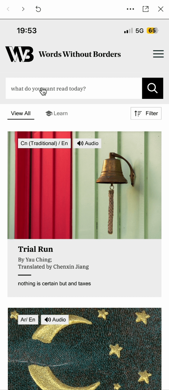
Finding #1: Ambiguous Tags
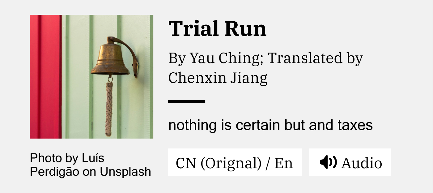
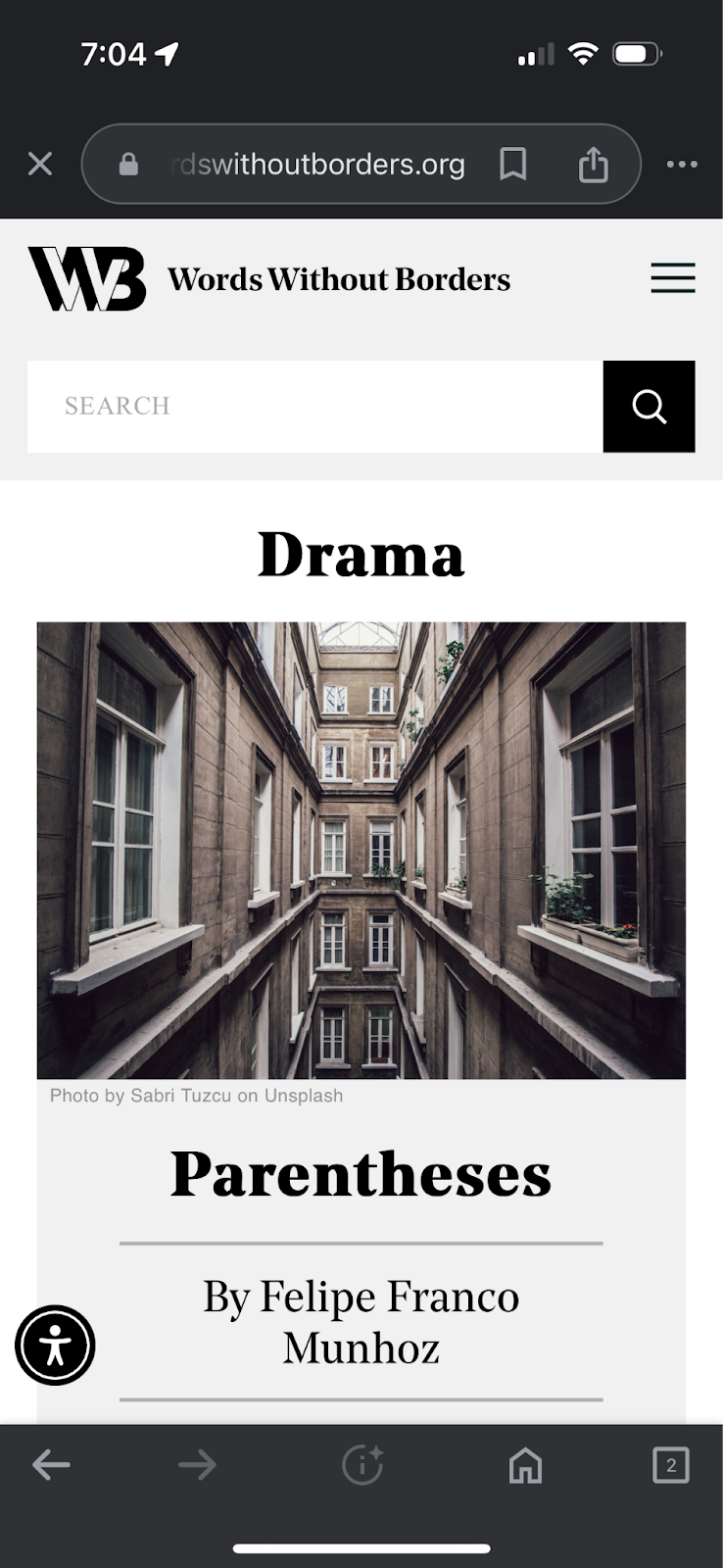
Only 37% of users were able to find multilingual articles on the site. Two users noted that they did not understand the term, “multilingual”, and two others noted that they were not able to find where the tag was located.
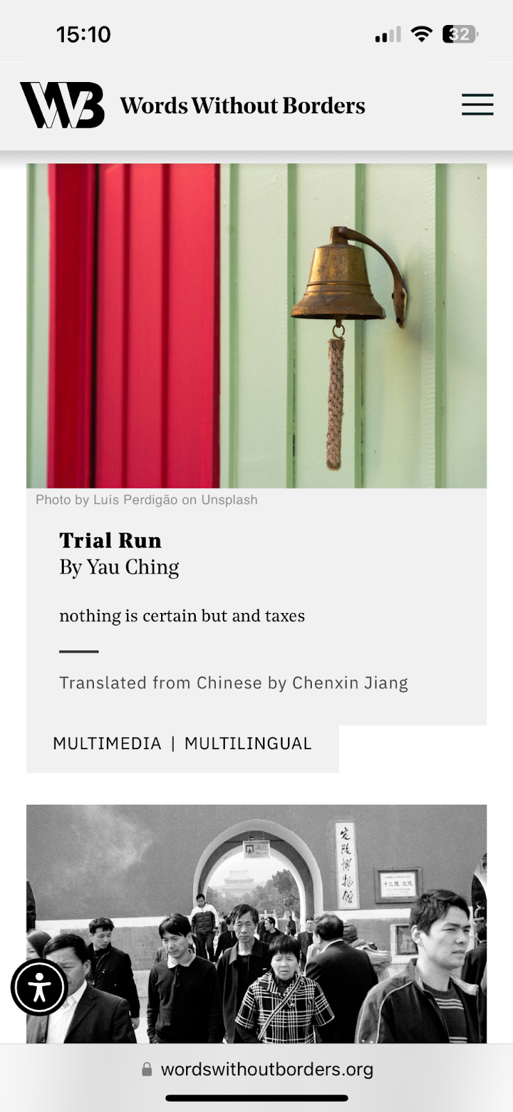
As shown in Figure 1, the tags are located at the bottom of the article card with limited specification.
Recommendation #1: Change tag placement and increase context
To make it easier for users to locate the tag and understand its meaning, we recommend placing the tags on top of the image for higher contrast, and to specify the language the article could be translated to. Additionally, letting users know what type of supplementary media was in the article prior to clicking into it may increase the chances of users exploring the article.

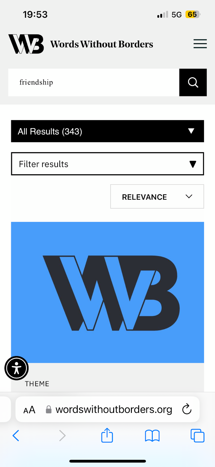
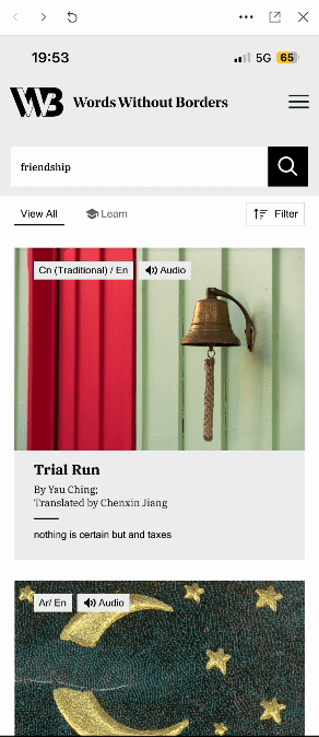
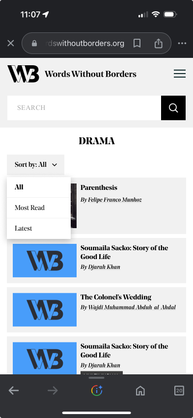
Finding #2: Users want a more advanced search function
While 100% of users enjoyed the search function on the mobile site, the advanced filters would only show up after the user’s first search, seen in figure 2. All users noted that they would enjoy the feature more if the filters were offered prior to searching.
Recommendation #2: Offer advanced search filters prior to the user’s first search and combine search features into one menu.
In the mockups provided, the advanced search filters combine the “Sort by” and additional filters into one sliding menu. Additionally, to guide users through their exploration of the Words Without Borders literature, the search feature can offer what is trending when the users click on it to perform a search.
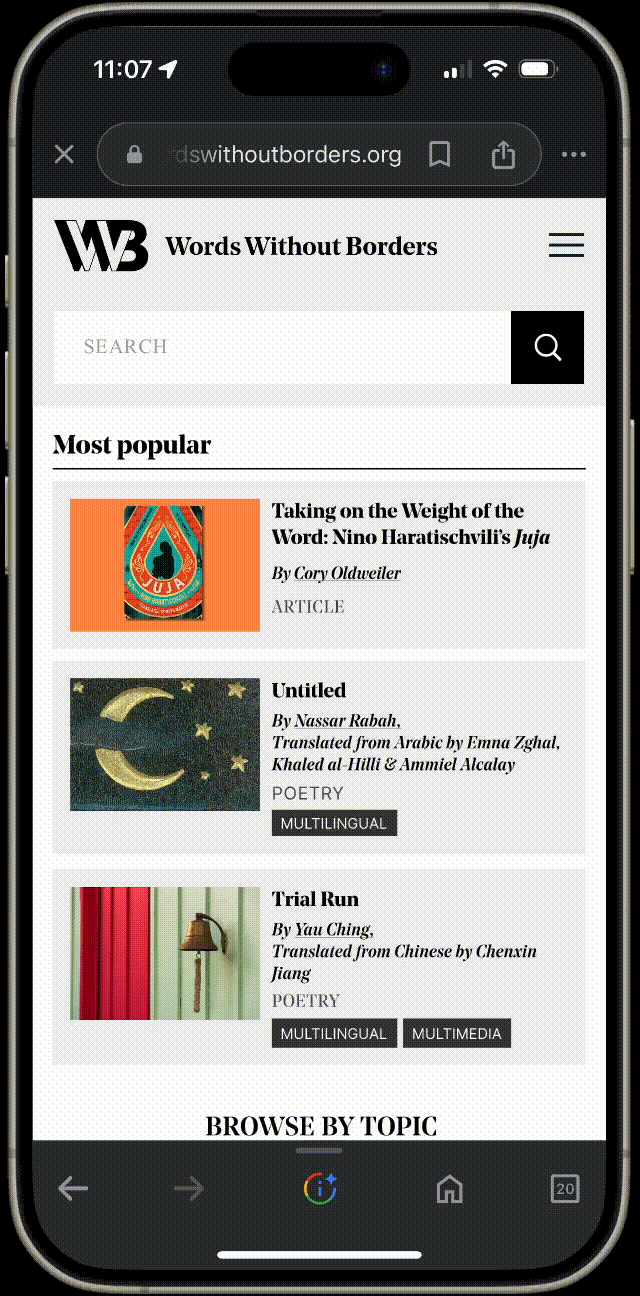
Finding #3: The Homepage offers too much content for mobile users.
5/8 users did not make it to the bottom of the homepage during their first task where they were instructed to explore the homepage. They ended up clicking into other pages before making it to the bottom. The most used features of the homepage were the interactive features, including the swipeable author highlights, the book reviews, the browse by topic button, and the browse by country drop-down menu. A few users also noted the article cards took up a bit too much space on their screen, only allowing one or two to be shown at a time.
Recommendation #3: Shorten the homepage and highlight the Interactive Features
To increase exploration and interaction with the homepage, we recommend shortening the homepage by:
- Decreasing the size of the article cards to only highlight the metadata
- Increase subheading text to improve the display of information hierarchy
- Give interactive features higher precedence by placing them higher on the homepage so users interact with them before jumping to another page
Finding #4: Users do not know where links are
Two users noted they did not know when they were clicking a link or not, due to its similarity with the rest of the text on the page. This led to unnecessary clicking, and frustrating page navigation when trying to navigate back to where they were.
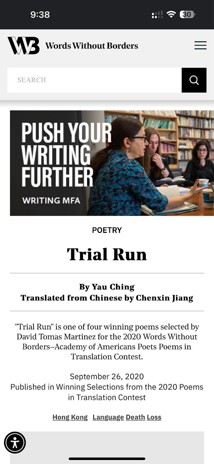
In the image above, the two names are actually links to the author pages, but the text looks similar to the rest of the page.
Recommendation #4: Increase Link Visibility
In order to decrease frustration in users trying to navigate the site, we recommend underlining the links and adding more space between the two lines so users have a better visual cue, and so they can clearly see which link they are clicking on.

Finding #5: Limited Ways for users to Explore Genre Pages
When exploring the site in the fourth task, some users noted there was no way to explore the many articles featured within each section. With no sorting or filtering options, they were left to just scroll through the options and see what they could land on.
Recommendation #5: Offer sorting features on each genre page
To improve the information hierarchy on each page, we recommend adding a “Sort by” feature similar to the search results page that lets users sort through the articles to find something that may interest them more. With so many literature pieces offered on the site, better filtering could encourage the user to continue their exploration rather than getting overwhelmed at the many options.

Moving Forward
With these recommendations, the Words Without Borders mobile site could become more optimal for mobile users, and encourage more exploration to view the multiple genres and thousands of literature pieces offered.
In addition to the test analysis and recommendations, we created an interactive dashboard on Google’s Looker Studio to make it easy for the Words Without Borders team to track their most important site metrics in an easy-to-view manner even after our partnership ends.
We are so grateful to have had the opportunity to work with Words Without Borders, and hope to see their site blossom as they work to improve their mobile user experience.

Leave a comment